Math · Geometry & data
Tables, Charts, Graphs, and Relationships
Estimated time includes reading and one quiz. Take the time you need.
Start here: key ideas
- Labels and units define what a display means.
- Count intervals, not grid lines, to determine scale.
- Interpolation estimates within the observed range; extrapolation extends beyond it.
- Association describes a pattern but does not prove cause.
What you’ll be able to do
- Read exact values from tables, charts, and graphs using titles, labels, legends, and scales.
- Compare matched variables and distinguish amount, change, and rate of change.
- Classify relationships as positive or negative, linear or nonlinear, and direct or inverse when justified.
- Describe association without claiming that it proves causation.
Labels and units define what a display means. Count intervals, not grid lines, to determine scale.
Read the display before the data
Start with the title, axes, units, legend, and scale. Then locate the requested row, column, category, or coordinate. A value is meaningful only with its unit.
Worked example: A line graph titled “Water in a tank” has time (minutes) on the horizontal axis and volume (liters) on the vertical axis. If the point at 4 minutes is at 30 liters, report 30 liters at 4 minutes. Do not reverse the variables.
A table is also a data display. Match both the row and column headings before reading a cell.
Compare matched values and rates
Compare like with like: the same category, date, unit, or interval. An absolute change is new−old. A percentage change is change÷original×100%. Average rate of change is change in output divided by change in input.
Worked example: Clinic A rises from 40 to 52 visits and Clinic B rises from 60 to 72. Both rise by 12, but their percentage increases differ: 12/40=30% and 12/60=20%.
Choose and question a display
Use a bar chart to compare categories, a line graph for change across ordered time, a circle graph for parts of one whole, and a scatterplot to examine two numerical variables. A truncated axis can exaggerate visible differences; calculate from the labeled values.
Interpolate with limits
Interpolation estimates between observed numerical points; extrapolation predicts beyond them and is less certain. Interpolate only when the variables are numerical and the pattern supports it. For a straight segment from (2,18) to (6,34), the rate is 4 per x-unit, so at x=3 the estimated y is 22. A bar chart of separate categories has no meaningful halfway category.
Describe relationships precisely
In a positive association, larger x values tend to occur with larger y values; in a negative association, larger x values tend to occur with smaller y values. A relationship may be linear or curved. A direct proportion has the form y=kx and passes through (0,0). An inverse variation has the form y=k/x and curves downward for positive values. A positive trend is not automatically a direct proportion.
Scroll the table sideways if needed.
| Input x | Direct: y=4x | Fixed start: y=4x+10 | Inverse: y=24/x |
|---|---|---|---|
| 1 | 4 | 14 | 24 |
| 2 | 8 | 18 | 12 |
| 4 | 16 | 26 | 6 |
Both straight-line models increase by 4 per unit of x, but only y=4x starts at zero and keeps y/x constant. In the inverse model, doubling x halves y and keeps xy=24.
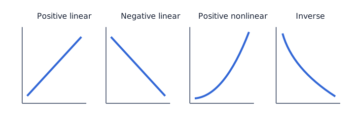
Identify independent and dependent variables from context. A graph can show association, but association alone does not prove that one variable caused the other; a third variable or selection effect may explain the pattern.
A decreasing relationship
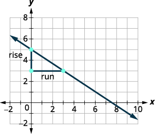
On this mathematical graph, x increases by 3 while y decreases by 2, so the slope is −2/3. A downward trend describes a relationship; by itself it does not prove that one quantity causes the other to change.
A decreasing relationship — OpenStax, via Mathematics LibreTexts. CC BY 4.0. Source image reproduced unchanged.
Terms to remember
- axis
- A reference line that carries a graph’s scale.
- legend
- A key explaining colors, symbols, or categories.
- interval
- The numerical gap represented between adjacent marks.
- interpolation
- Estimating a value inside the observed data range.
- extrapolation
- Predicting beyond the observed data range.
- positive association
- A pattern in which variables tend to increase together.
- negative association
- A pattern in which one variable tends to fall as the other rises.
Your quick summary
- Labels and units define what a display means.
- Count intervals, not grid lines, to determine scale.
- Interpolation estimates within the observed range; extrapolation extends beyond it.
- Describe positive, negative, or no association from the overall pattern without claiming that association proves causation.
Lesson quiz
Check what you learned, then review the explanations. This quiz saves results on this device only. Sign in to save quiz results to your account.
You've got the concept — now drill it like the real TEAS
Unlock the full practice bank, timed full-length exam simulation, and practice across topics. Your free lesson and its lesson quiz stay available.
Unlock practice — free for 3 days$0 today; then $19.99/month after 3 days. Card required. Cancel before renewal to avoid a charge.